How We Designed a Way to Implement Short-Form News on Hulu’s TV Platform
Case study
Short-Form Content
TV/Living Room Platform
User Research & Testing

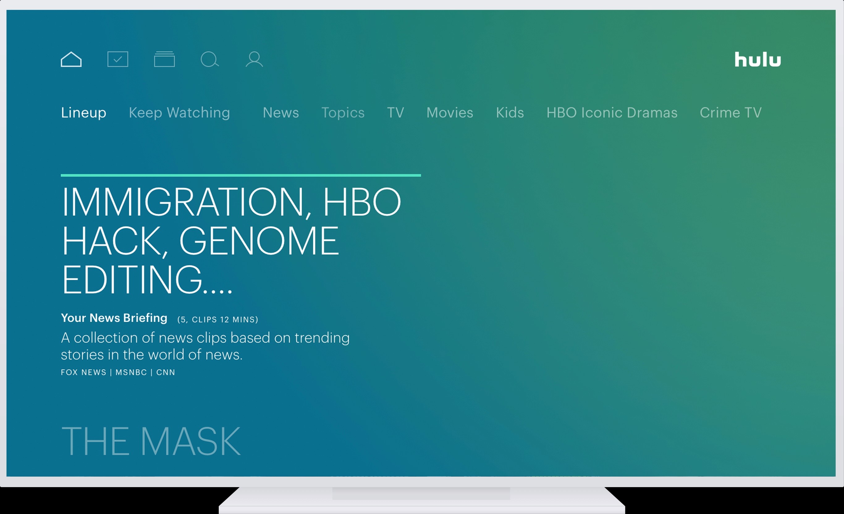
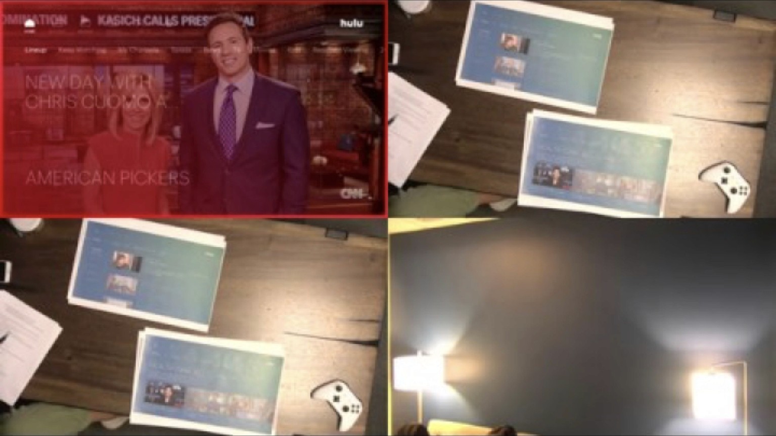
You can now watch clips of news on your TV
Short-Form Content is One of Hulu’s Unique Advantages
Hulu has a unique advantage as a streaming service because their content is timely–new episodes are available the morning after they premiere on live TV.
Short-form content, i.e. clips from episodes, can be even more timely, as clips are uploaded throughout the same day, with accurate metadata provided by networks. When I interned at Hulu, short-form content was an area that the leadership was looking to grow.
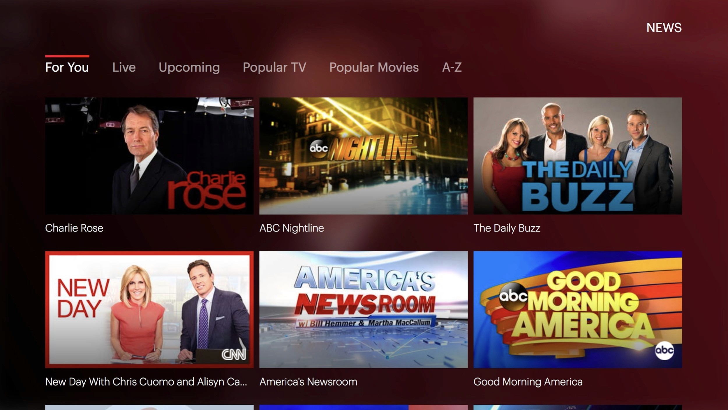
Clips Were Only Available on the Web Platform
The problem my team was tasked with was to design a solution to implement news clips on the living room platform.
At the time, short-form content was only available via the web app—users couldn’t watch clips on mobile or living room devices. On the web, clips performed relatively well, as tracked by the Hours per Active User metric. This provided motivation to the leadership to surface the content on other platforms.

News content was the most viewed category of clip on the web platform.
We focused on surfacing news content for a couple reasons:
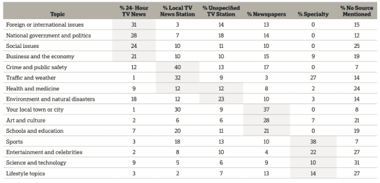
Strong interest – both Hulu subscribers and non-subscribers indicated strong interest in News content, second only to Movies
Views from web – 45% of clips views on the web were of News content, making it the most viewed kind of content
News formats suited to clips – the format of news segments lends itself to clips focused on specific stories

Of all genres of content, News had the second-highest interest from both Hulu subscribers and non-subscribers.
We Recommended “Top Stories”, a Lightweight Way to Implement News Clips
Our recommendation was to implement news clips on the TV platform in the format of a News Digest–a collection of clips, totaling about 10 minutes in length, composed of the most viewed clips that day. Below I’ll discuss the finer details of content strategy, UI controls and overall user experience.
Of all genres of content, News had the second-highest interest from both Hulu subscribers and non-subscribers.
Our Solution Targeted the Hours per Active User KPI
In 2017, Hulu had three primary KPIs to measure the success of their product:
Monthly Churn
Convert to Pay
Hours per Active User
We targeted the Hours per Active User metric when designing our solution, specifically the Monetizable HUA, meaning content with ads. A feature unique to clipped content is that it provides a way to ease users into a full-length program they might not have otherwise watched, boosting the hours per active user.
Our Solution Aligned with Broader Product Initiatives
Of the various product initiatives at Hulu at the time, this work contributed to two of them:
Creating smarter strategies for promoting and discovering content
More informed decisions via analysis and experimentation


Of all genres of content, News had the second-highest interest from both Hulu subscribers and non-subscribers.
A collection of clips allows Hulu to surface a wider variety of content (networks, shows, episodes) to users, enhancing discoverability for users. Additionally, it provides a lightweight way to promote content—either through editorial strategy (i.e. what clips are included) or short ad breaks between clips.
Short-form content also makes for quicker experiments. It’s much faster to tune a recommendation algorithm on 30-second to 2-minute clips than half-hour or feature films. Also, because of the high quality of the metadata provided by networks, analysis can be very granular–it’s easy to imagine a collection of entertainment news clips focused on a user's favorite personalities.
Our Review Focused on Finding the Most Value for Users as Weighed Against Engineering Effort
As you can tell, there are different strategies to implementing news clips on the TV platform, and they each require different levels of engineering and editorial work. It’s not a small task to introduce a recommendation algorithm, or to spin-up an editorial team with a cohesive content strategy. The variables we balanced were user benefits with Hulu’s effort to build and maintain the feature.

Of all genres of content, News had the second-highest interest from both Hulu subscribers and non-subscribers.
In light of this, our research focused on finding out what users cared about when it came to news and personalization. Where could Hulu get the most bang-for-their-buck when introducing clips to the TV platform? Prima facie, news clips seemed to provide the most value. Our research questions centered on defining user expectations of News as a category of content, and desires for personalization (i.e. do users only want to see clips from a certain set of networks?).
We had four phases to our design process:
Researching users news habits, segmentation, trends, etc.
Designing features and interfaces
Testing our designs with real users
Formulating a final recommendation for future work
Personalization Was the Crux of the Problem
From both our literature review and the tests we conducted with users we found that users have fine-grained expectations around personalization for news. This finding increases the risk of implementing news clips in a way that users found off-putting.
There were three ways that personalization could be introduced with news clips. In order of increasing effort they were:
None–Every user sees the same collection based on the top viewed clips.
Recommendation algorithm–Users are shown a collection of clips based on their past behavior and/or by completing a taste–picking exercise.
Editorialized–Real people, perhaps with the help of a recommendation algorithm, assemble collections based on a content strategy.


Of all genres of content, News had the second-highest interest from both Hulu subscribers and non-subscribers.
User Tests Informed Us That Users Didn’t Want Personalized Recommendations for News Clip Collections
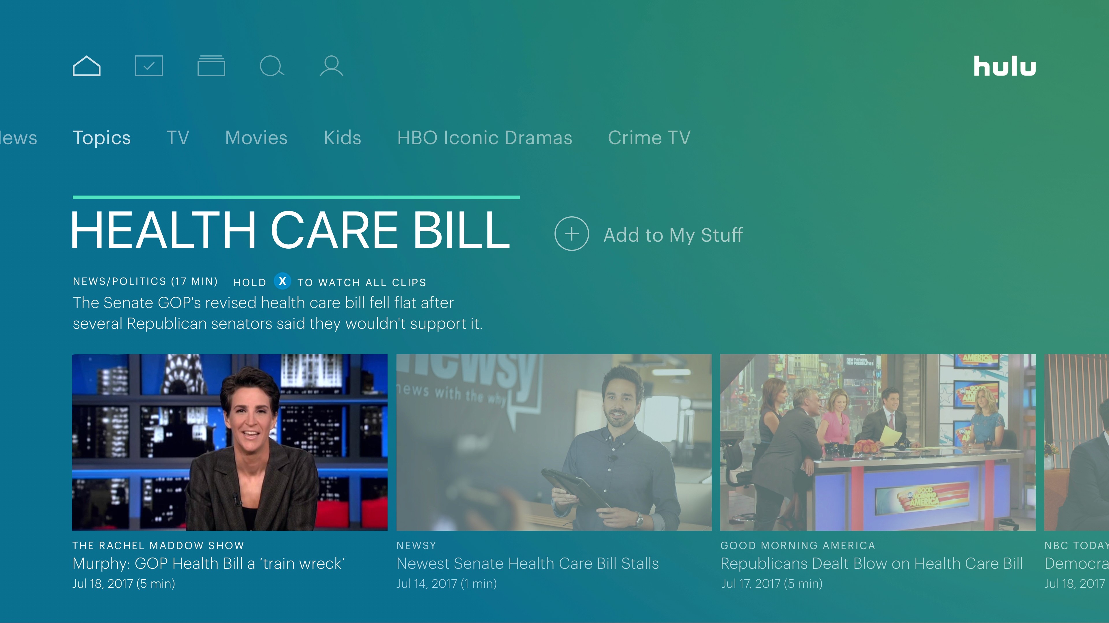
We knew that people had strong preferences for their news services, especially older viewers who watched cable news networks (CNN, Fox News, etc.). However, we were surprised to find during testing that when clips were formatted as “Trending Stories” with each collection focused on the latest headlines for a given topic (i.e. “Trump’s Immigration Bill”), users expected to see an array of sources and perspectives. It seems that for watching full programs or live TV, viewers were loyal to a source/network, but when presented in a Digest they wanted multiple angles covered.
Of all genres of content, News had the second-highest interest from both Hulu subscribers and non-subscribers.
We Were Limited to Hi-Fi Paper Mocks
One limitation of our study was the use of paper mocks prevented us from showing real clip collections in the TV app. Instead we had to tell participants what the experience of watching a clip collection would be like and refer to hi-fidelity mockups. It’s my belief that people answered our research questions in ways that put them in the best light–it’s common to believe you should get “both sides” of an issue, but do we really end up doing that? I’m not sure.
We did test a taste-picking exercise with users, the idea being that this would rapidly train the recommendation algorithm and thus show people more relevant content, sooner. However, users felt it was a bit “overboard”, i.e. they didn’t really see the benefit of it compared to having yet another step added to onboarding.
Of all genres of content, News had the second-highest interest from both Hulu subscribers and non-subscribers.
A Theme of the “Front Page” Developed
Our user testing took place over two afternoons and we reviewed each participant and tabulated their performance. Gradually the theme of a front page started to emerge. Like how the front page of a newspaper is the same for everyone that day, users expressed a desire to see the top headlines with follow-up coverage (i.e. clips that cover slightly different angles to a story, with some overlap).
Our original hypothesis was that showing people collections of clips based on their preferences and from their favorite sources would be the stickiest way of implementing clips–it would get people to watch more and return to the feature. This could still be true–look at the success of TikTok’s For You page, which didn’t yet exist in 2017–because we didn’t test real clip collections with a sufficient number of users.
A/B testing does not answer all product problems though, and it has a high cost as a method for decision-making. You go into testing not knowing the effect size–maybe personalized collections would induce slightly higher HUA, but would it be worth the engineering/editorial effort at that time in the business? Those questions were for leadership and I believe we formulated the problem well for them and provided good insights that informed the eventual implementation of news clips.


Of all genres of content, News had the second-highest interest from both Hulu subscribers and non-subscribers.
We Presented Our Findings and Recommendations to Leadership
The final recommendation we made to leadership, in the format of a presentation and documentation given to senior management at Hulu, was to introduce news clips as a Trending Stories format, something like a news digest, that pulled together the top-viewed clips for a given day. This was motivated by the front page theme we observed in user testing. It was also the lowest effort, engineering wise, given the quality of metadata made it easy to sort clips by topic covered and title.
We also recommended that News should become a top-level category, alongside Movies, TV and others. Nearly every user expected to find news as its own category, however the status quo was to have it two-layers deep, as a Genre of TV. Users expected this top-level news category to include collections of clips that went more in-depth than Top Stories. Several people also reported hesitancy about personalizing this page with only the networks or shows they watched.
Feature Design
Of all genres of content, News had the second-highest interest from both Hulu subscribers and non-subscribers.
As for the UI controls when a user played a clip collection, we followed the basic pattern of on-screen information and actions established by Hulu’s design language for TVs. A unique feature we introduced was the ability to press a button (e.g. X on Xbox) to drop into the full-program. While rather simple and obvious, we felt it would increase HUA when users otherwise wouldn’t have even clicked on the program to begin with. We also chose to auto-play the next clip or collection with a short pause in between to give the user time to choose to watch the full program.
Also, similar to how users could press down on the controller to see Next Episode or Shows Viewers Also Watched, we put the clip lineup in that place so users could easily navigate to other clips or stories/topics.
Presenting to Leadership
We presented our design solution on the last day of our internship and received great feedback from fellow designers and the higher-ups who watched. While we weren’t able to see the project all the way through to implementation, we’d met with the engineering team who would be implementing the final design solution.
Implementation
Jumping ahead to 2021 I noticed that our work was finally implemented in the Hulu product for TV. I’ll briefly go over the differences I’ve noticed between their implementation and our recommended design solution. My boss and other contacts have moved on at this point from Hulu so I no longer have insider insight–this is my critique from a purely user perspective.
Analyzing Differences in Implementation
Starting with the information architecture, we can see there’s only one top-level menu and they’re text buttons rather than icons. Since 2017 this has become standard practice for streaming apps–we noticed confusion from users (who were even Hulu employees) during testing about the different levels of navigation. We didn’t take it upon ourselves to rework the IA but I’m glad to see clarity win-out here.

Of all genres of content, News had the second-highest interest from both Hulu subscribers and non-subscribers.
Our recommendation to start with the lowest-effort/highest-reward implementation was largely followed, but the details are different.
They’ve added “News” as a top-level category, which was our recommendation. We don’t see clips being featured in the main Cover Story (i.e. the content you see when you first launch the app) and I think this is because clips aren’t yet being formatted as collections around stories. A single clip doesn’t feel weighty enough to warrant the prominence of a cover story.
Instead of collections, clips have simply been added as the second row of content under the News tab. This is the easiest thing to do engineering-wise–no new design patterns to build. In tandem with that we don’t see the duration of a clip included in the UI. We felt that was important info to the user to entice them to watch–it’s only a few minutes! But, because other content like shows and movies don’t have the duration listed, it makes sense to not go to the effort to build it out for clips.
Of all genres of content, News had the second-highest interest from both Hulu subscribers and non-subscribers.
The network logo, displayed prominently on the thumbnail, is the main identifier for the source of a clip. We included this info as text where the subtitle goes. Including the logo, something more recognizable, makes sense though, especially considering users are loyal typically at the network level.
There is no “air date” or info like “Updated 5 minutes ago” and I believe this is to make all clips feel timely. Users reported to us that old news (an oxymoron, I now realize when writing this) wasn’t relevant to them. Clips have an immediacy to them–something always feels a bit like “breaking news” when clipped, as if it’s urgent to get this info out rather than produce a stand-alone segment. No air date means no old news, from a UI perspective.
And finally, there’s no personalization or editorialization to the clips as far as I can tell. This is in line with our research findings and recommendation. It’s simply less work–though maybe they have someone simply approving which clips get surfaced out of the most-viewed ones. I haven’t gone to this page in the app during a breaking news event to see if it updates in response.
Conclusion
In conclusion, our design solution and recommendations informed the final implementation of news clips on the TV platform and you, yourself, can go take a look. A little bit of my team’s thinking is now on devices throughout the world, pretty cool!
Planted Seed Take a While to Grow (at big companies)
Testing Your Assumptions in Context is Vitsl
Lorem ipsum dolor sit amet consectetur. Non lobortis cursus fames dictum bibendum. Euismod ipsum viverra mi et cras curabitur augue.
Lorem ipsum dolor sit amet consectetur. Non lobortis cursus fames dictum bibendum. Euismod ipsum viverra mi et cras curabitur augue.